Butter & Pop
Subscription Box and Package Design
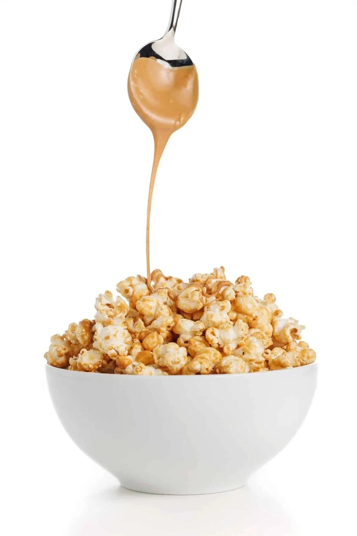
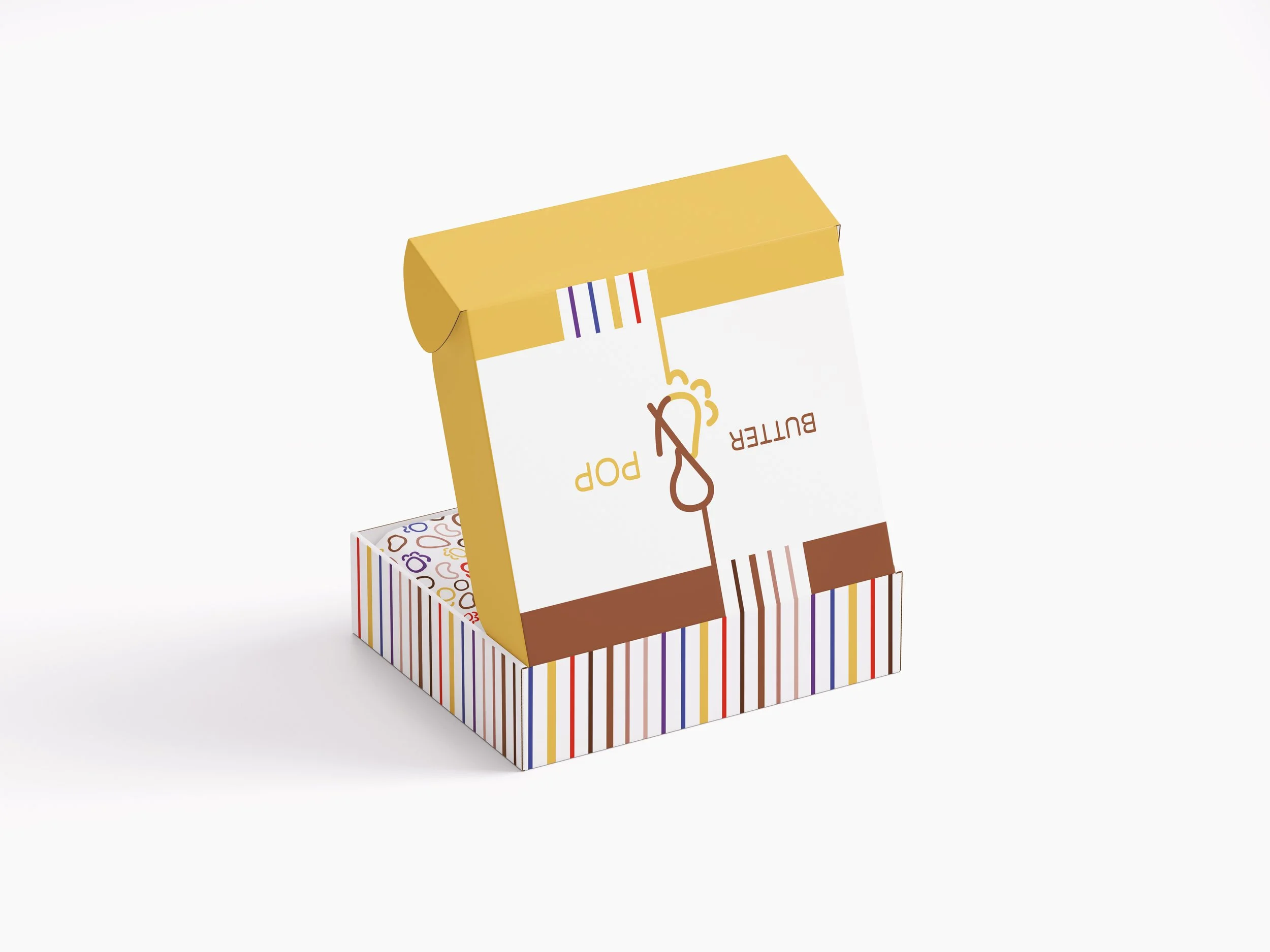
Butter & Pop is a subscription box that celebrates the seamless marriage between peanut butter and popcorn, the overlooked cousin duo to chocolate-covered popcorn, with an emphasis on organic eating. Consumers are invited to make their own nut butters, which they can pair with a variety of popcorn types they collect. The box each month includes a bag of organic nuts, a bottle of organic kernels, and a jar to store the nut butter when it is made. Since each popcorn has a particular profile, it shares a box with the nut butter that complements it most.
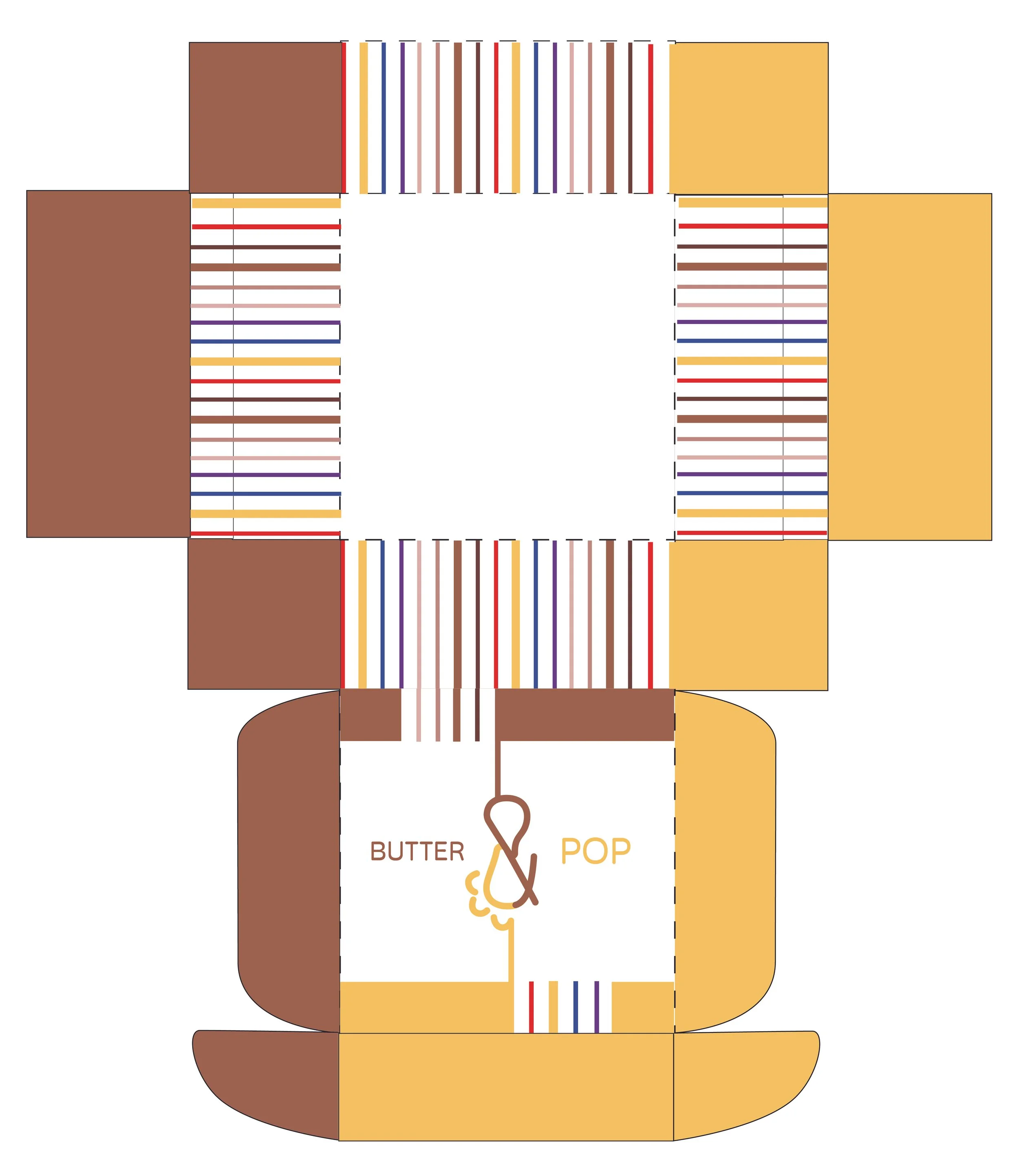
The Box
The Box
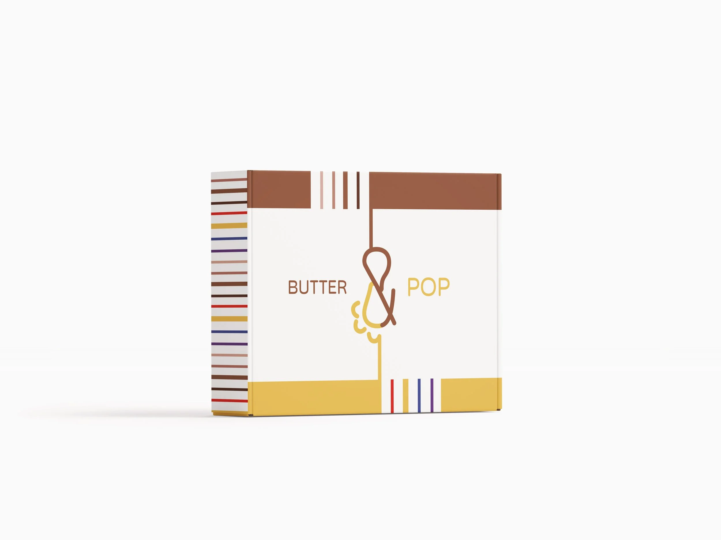
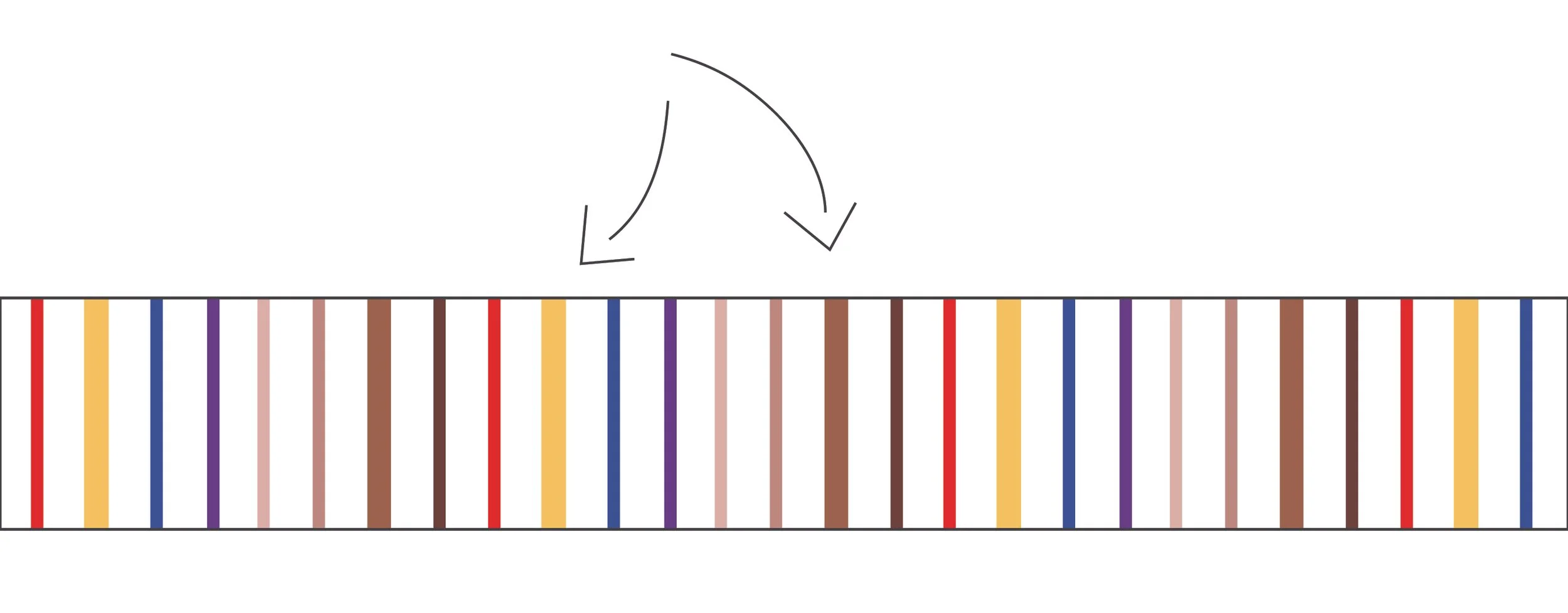
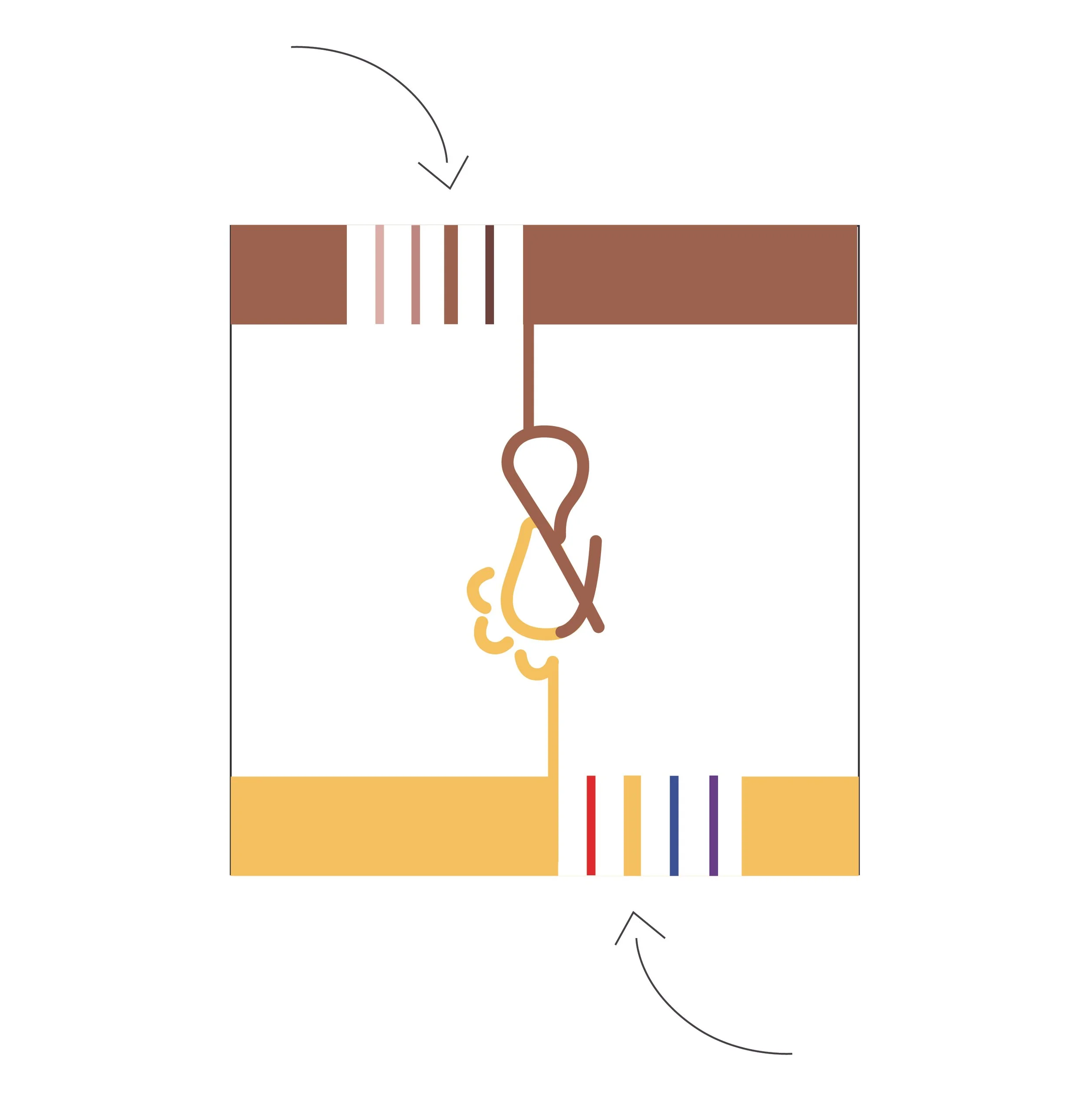
The bolded stripes represent the type of nut and popcorn that is inside the box that particular month. Here, it’s the original peanut and yellow popcorn combination. Next month, the hazelnut (dark brown) and red popcorn stripes would be bolded.


“Nut butter that’s real & popcorn that’s pure. Movie theater popcorn’s got nothing on us.”
— Butter & Pop
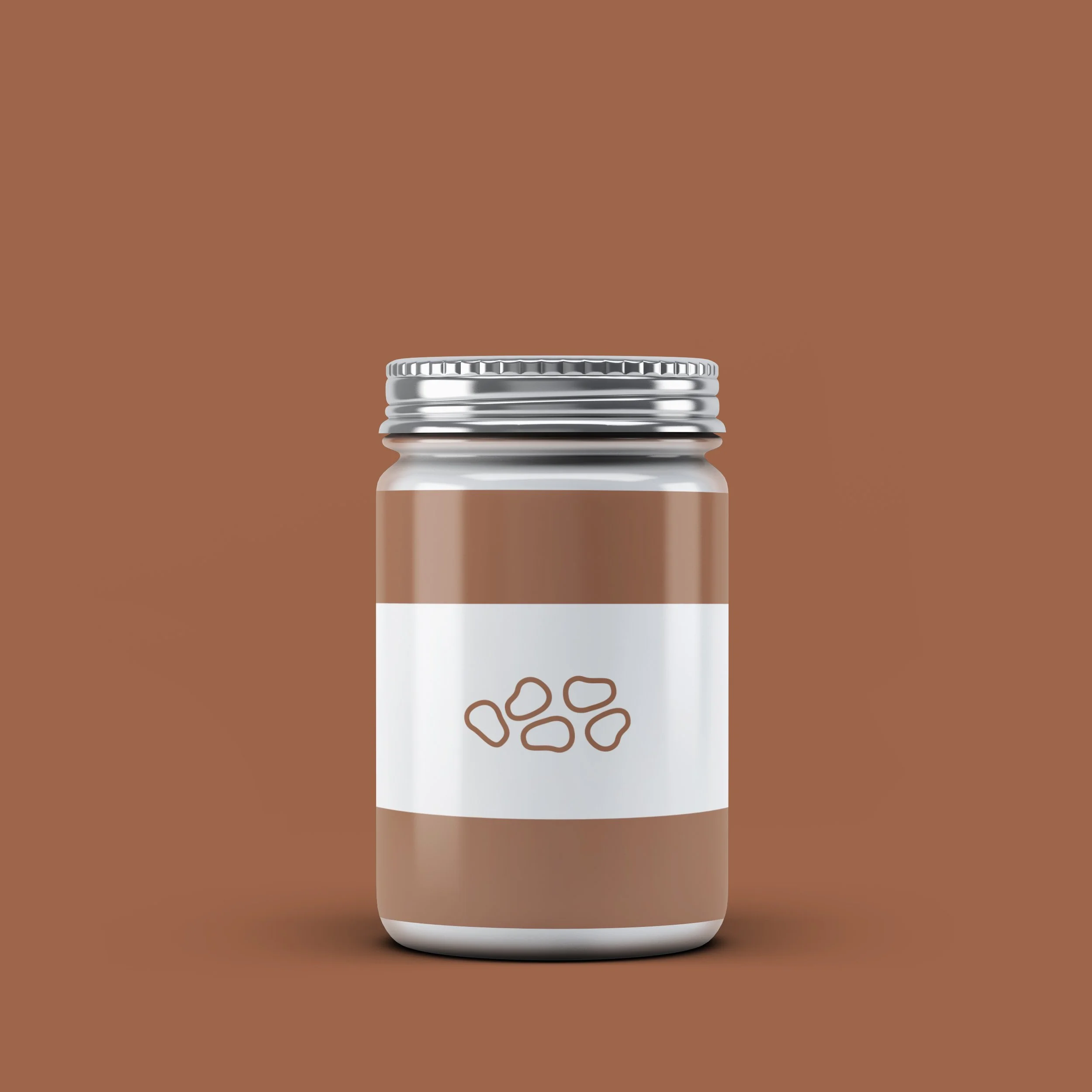
The Butter
The Butter
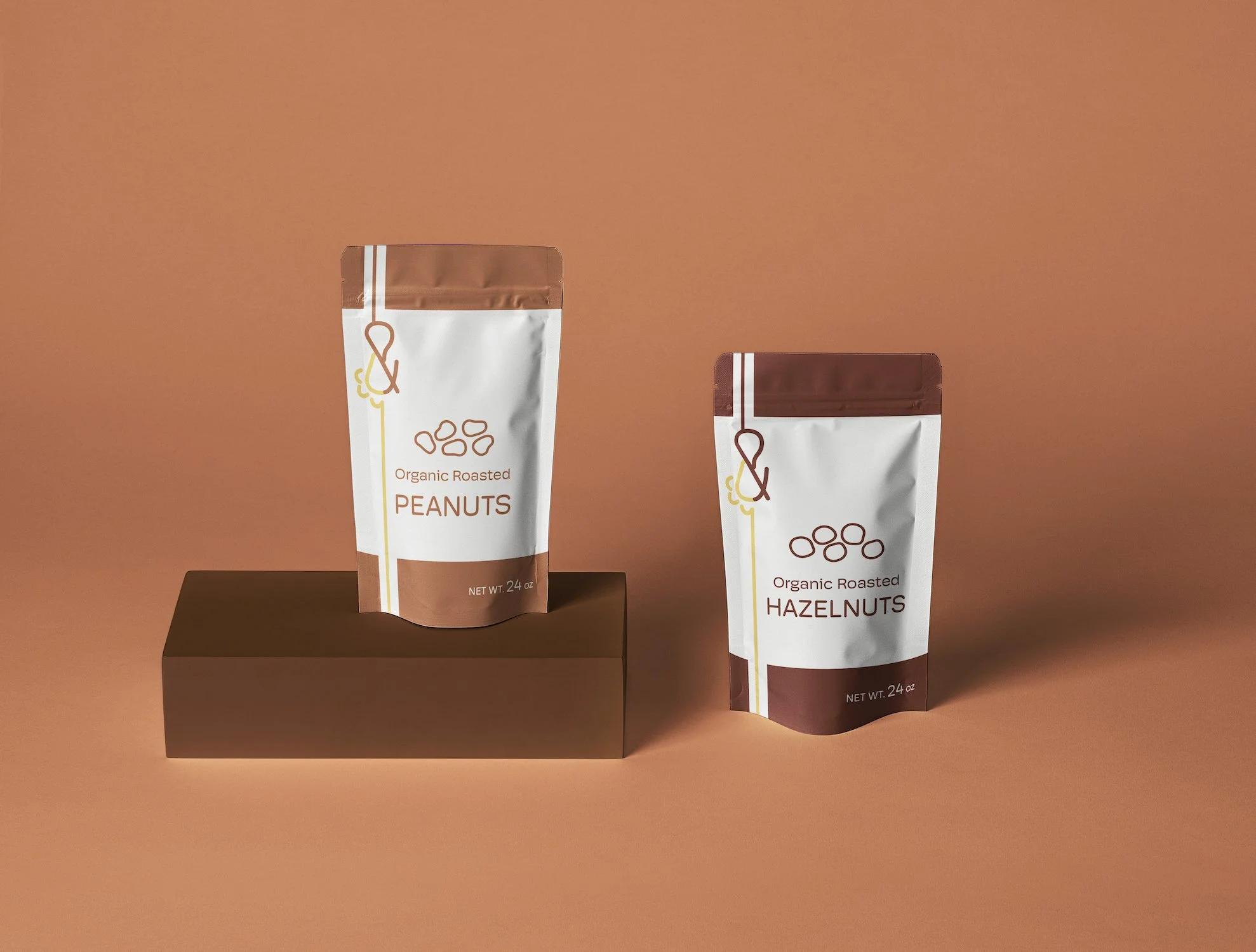
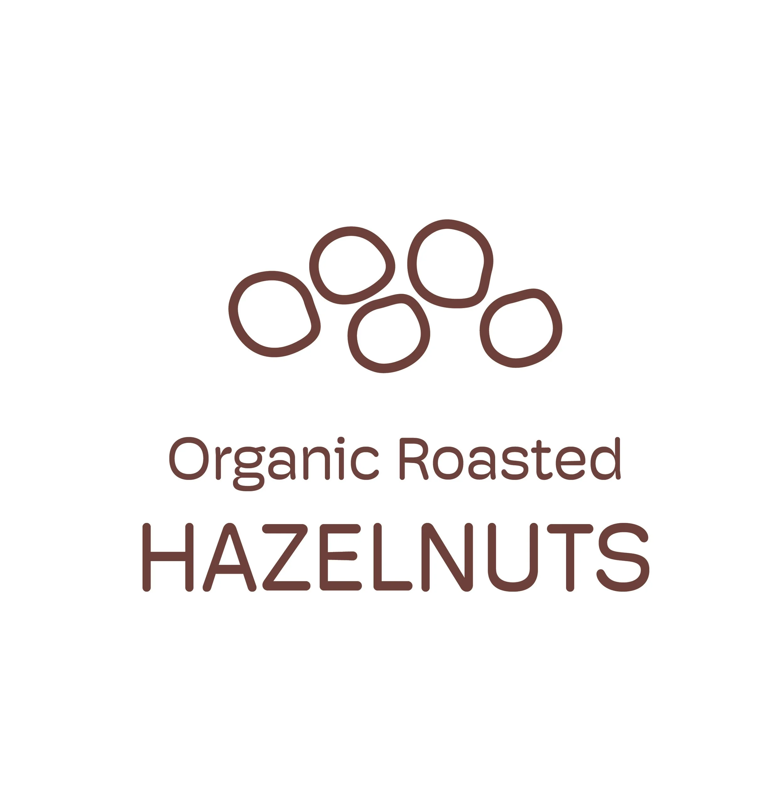
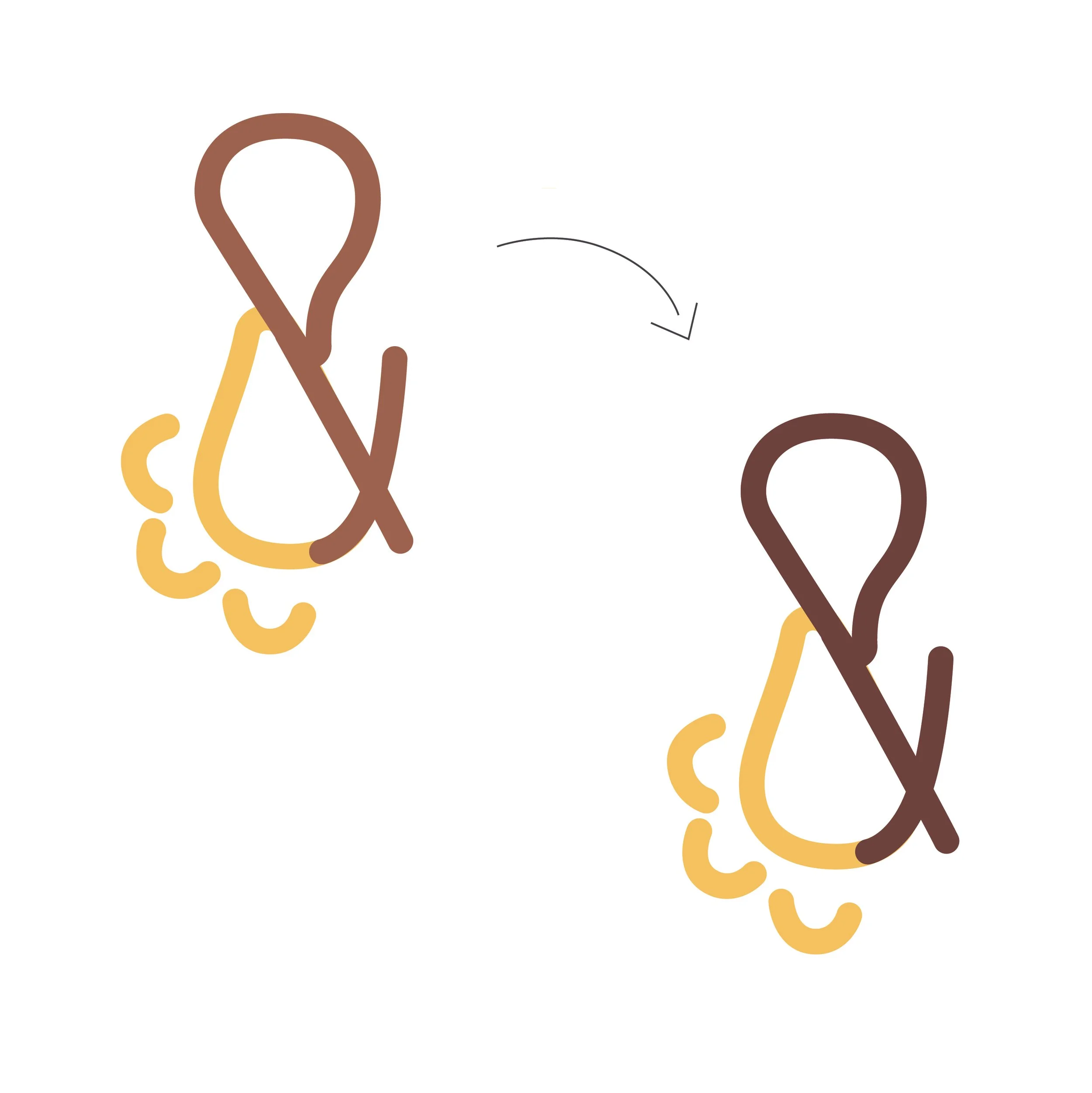
Each nut is identifiable by its unique icon and colors - the color change is carried into the nut part of the logo each month. I aimed to create a modern, trendy, sleek design that is identifiable and intuitive. Shown below is the icon and logo variation for the hazelnut products.
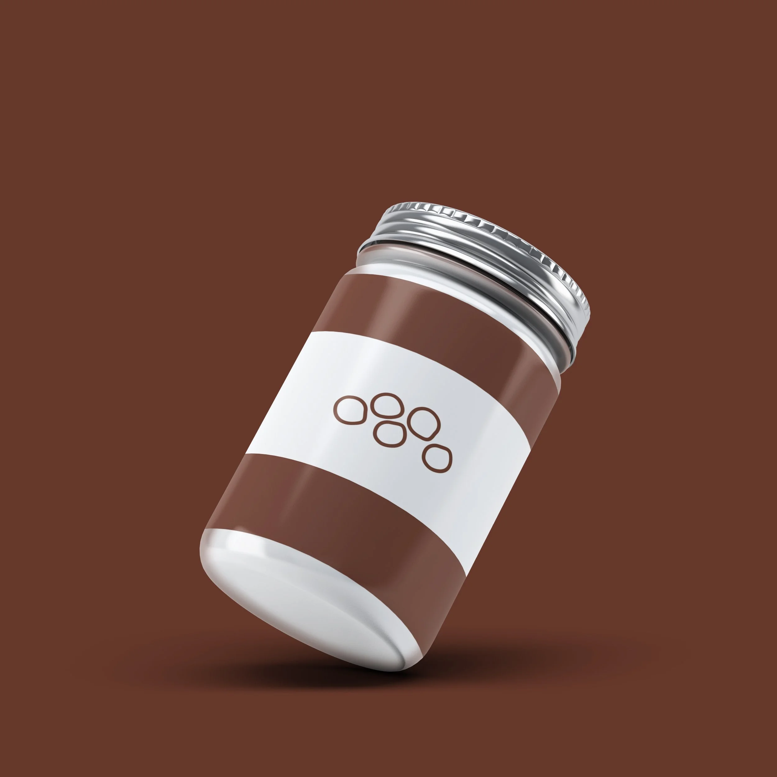
The jar
to store the nut butter when it is made. The peanut, hazelnut, and almond jars are shown.

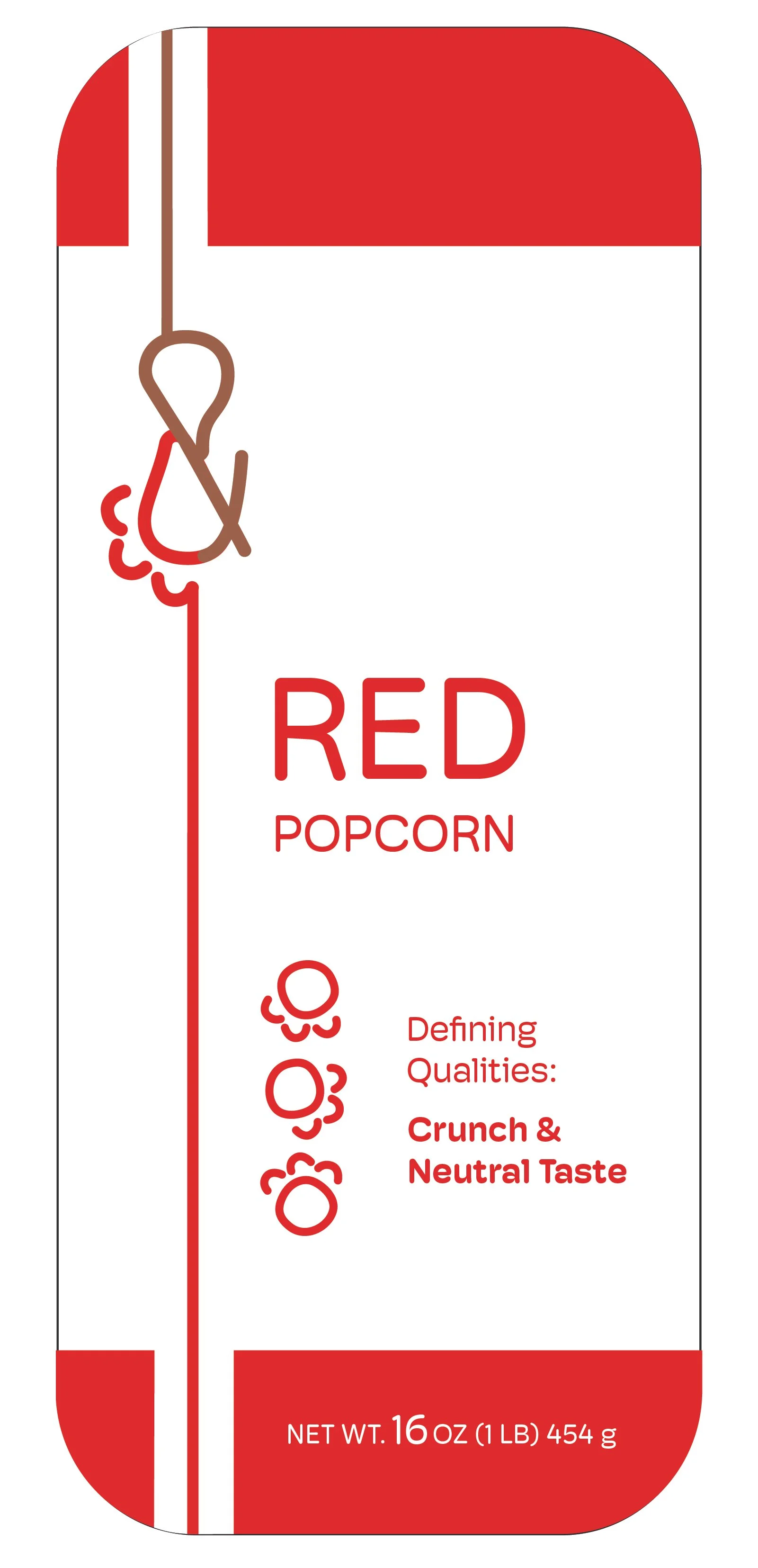
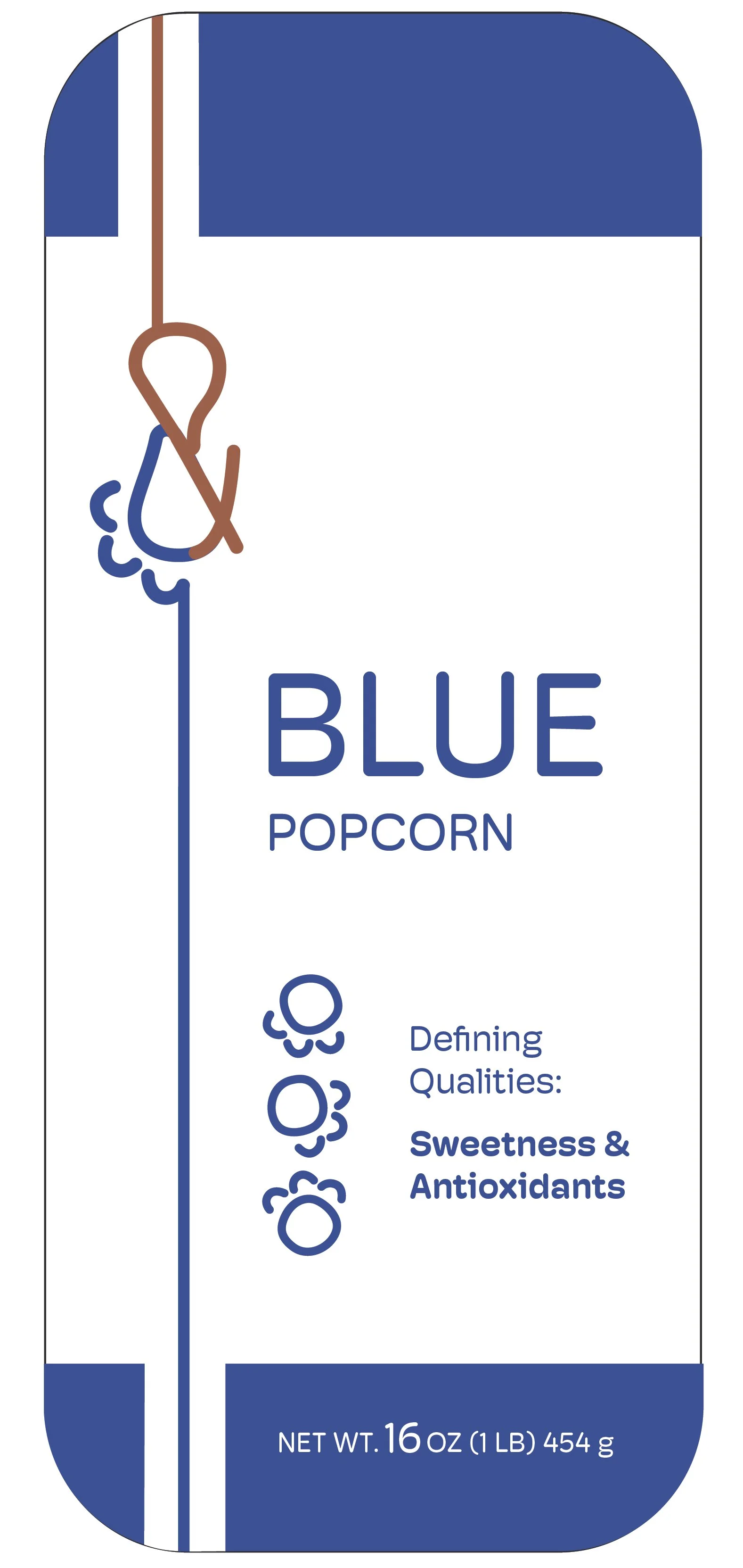
The Pop
The Pop


Similar to the nuts, the popcorn part of the logo changes each month. Shown above is the logo variation on the red popcorn label. Each type of popcorn has unique features that make it special, and I wanted to emphasize this on the label.