Mac Shac
Food Truck, Menu, and Packaging
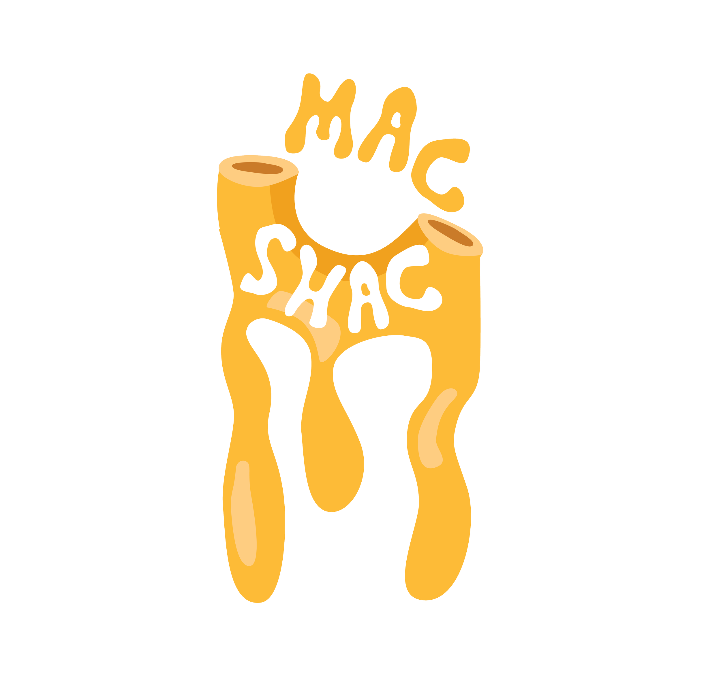
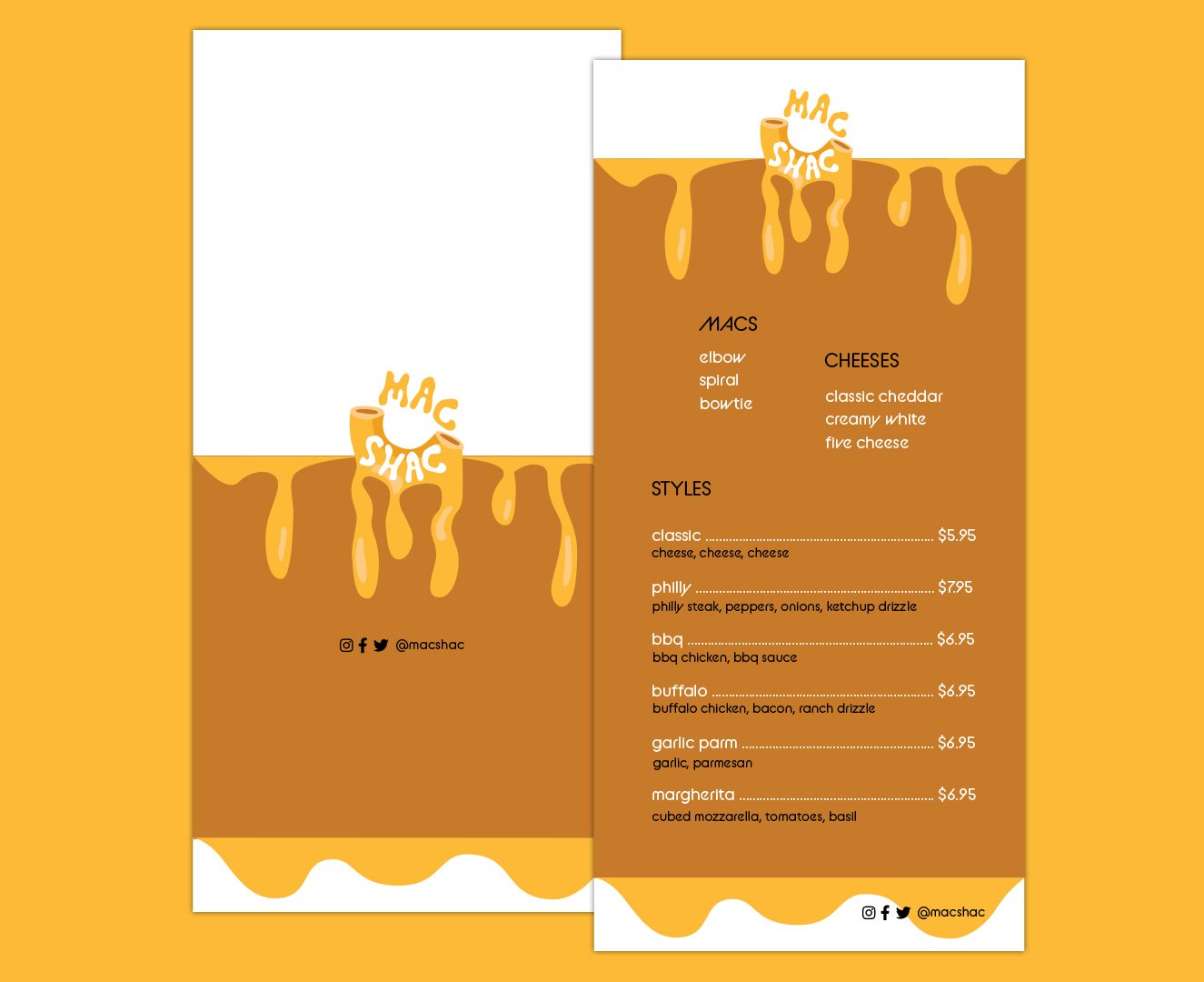
I created Mac Shac to conceptualize a method of eating mac and cheese on-the-go. In its branding, I aimed to emphasize mac and cheese’s comforting nature through warm colors, cheesy letters, and gooey elements. I wanted the type to look a particular way, and so I created my own typeface, as shown below. The brand would be known for its intriguing flavors and innovative mac cup, which makes for a comfortable walk-and-eat experience.
Our slogan is *insert cheesy slogan here*, on trend with more “meta” branding seen and enjoyed often nowadays.


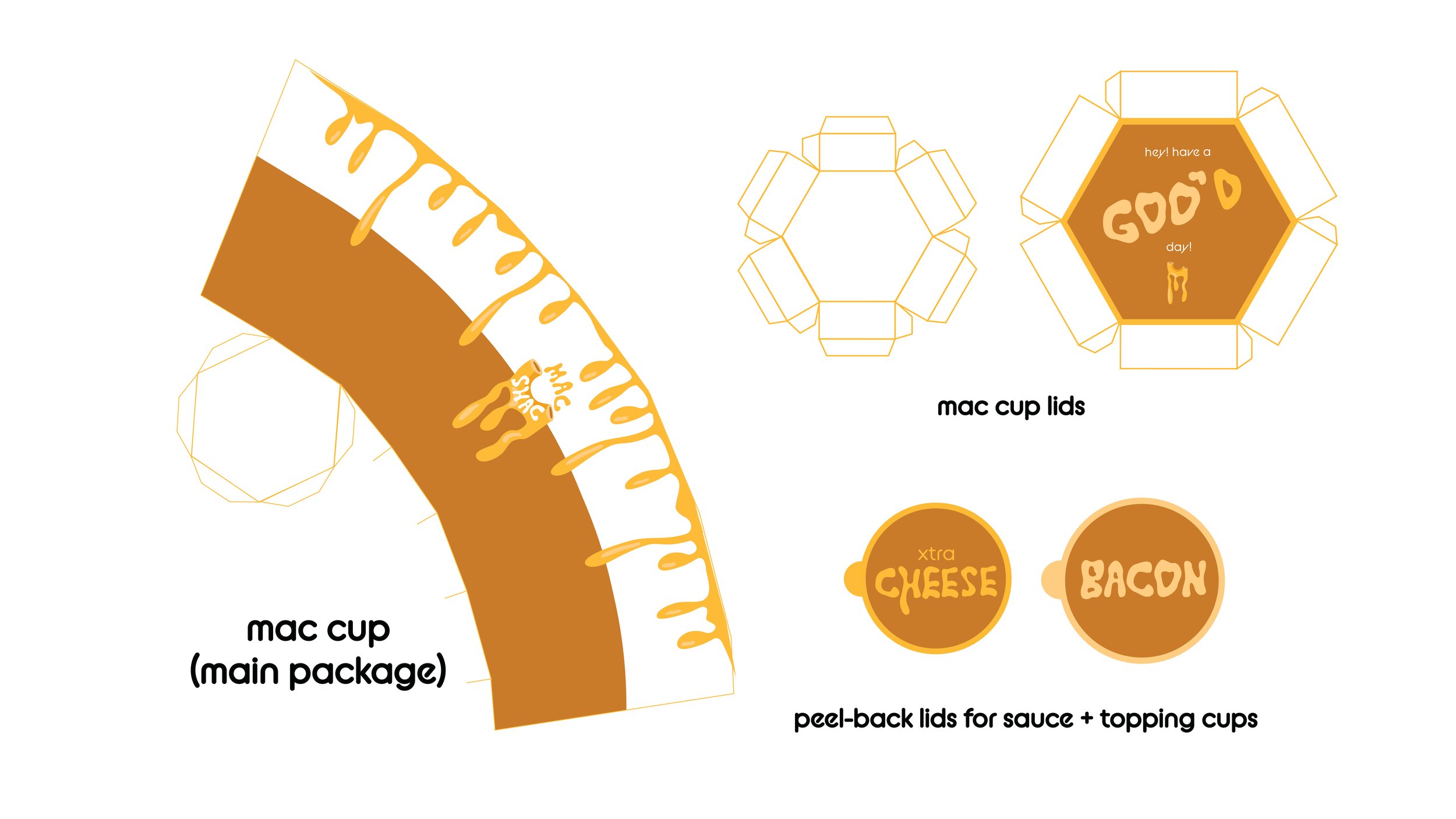
Our mac cup is unique and practical. Its hexagonal, double-layer lid is eye-catching and identifiable. In the top layer, the customer finds a foldable spoon, which one can save for later if necessary. I also designed cups with peel-back lids for extra sauce and toppings on customers’ request. Below are the dielines and rough prototypes I created.
*Note: on these packages, you’ll see an older version of my logo. I hope to revise and reassemble.